The Tribute Handbook: Designer Blog
KleverCase has grown as a brand on the back of creating beautifully designed cases based on classic novels. 2016 sees us use modern classics as inspiration for new 'book' designs and after much mutual admiration via instagram, we commissioned talented artist Alexis Lampley (aka DropAndGiveMeNerdy) to create a Hunger Games themed cover for us.
This is her story covering the entire process, from approach through inspiration, working drawings and all the way to the finished product.
"When Klevercase approached me about designing a Hunger Games themed case, I was incredibly excited. (I had to remind myself not to put in more than a professional amount of exclamation points in my response). The design almost immediately began to take shape in my mind.
The movie and book branding both guide our thoughts to the mockingjay as the symbol to represent this series. Too many covers already have variations of that, so I didn’t want this cover to be confused with those. I wanted this case to stand apart. I also really liked how the Book of Spells case could easily belong in the Harry Potter movie prop department, and wanted to do similar with this case, creating a design that felt like it came from the world of The Hunger Games. What sprang to mind was propaganda.
Propaganda is an integral part of the Hunger Games world, especially in book 3, and yet I haven't seen much, if any, of that in the available artwork for this fandom. It was the perfect direction to go.
When I think of propaganda poster styles, my mind jumps immediately to one of my favorite artists: Shepard Fairey. I discovered him about eight years ago, and have loved and admired his work ever since. I wanted to pay homage to his style, especially the aspect of weaving beautiful, intricate patterns into otherwise simple, bold, graphically styled designs.
Example of his work:

It was these patterns that inspired me to still incorporate the mockingjay symbols in the piece in a creative and subtle way, using one of the book’s strongest themes: flowers. Primrose, President Snow’s white roses, Rue; Important characters, important moments. All connected to flowers in some shape or form. With the flower idea and the pattern idea swirling in my head, it wasn’t long before the two merged, and I realized that I could create a “floral” pattern using the circular mockingjay symbols as the centers. Naturally, this meant the “center crease” in the petals, usually drawn as a line, would be represented by an arrow.
Initial sketches of the background pattern:

I was originally going to create three different flowers with aspects from each book/corresponding symbol, however, I soon realized that the final book and final mockingjay is free from the circle, and therefore would do better in the space between the flowers in the free-form pattern. Meanwhile, the two circled symbols would remain centers of flowers which would alternate in the pattern and be colored in opposing colors. I still wanted to incorporate other small significant details in the flowers, like I had done with the arrows, so the free-form space is filled with flame —a nod to Catching Fire— as well as the berries from book one. There are also little parachutes helping to make up the Catching Fire flower.
All of this thought and detail for what amounts to the background. But I wanted it to have layers of detail that you would be able to discover slowly, when you stopped to really take it in. And I couldn’t not have the mockingjay symbol somewhere, after all!
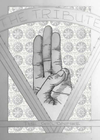
The mockingjay is a symbol of Katniss, and thus the rebellion, but I believe that the three-finger salute was such a uniting symbol, and one that would work well as the front cover’s eye-catching image. It is a great alternative to the mockingjay symbol, holds equal weight and importance in the series, and also carries a lot of emotional weight in the films.
Original Sketch for the Salute and Title:

But the real emotional weight is carried in the words chosen for the back cover: Real or Not Real. There were a few quotes to choose from, but this is a favorite of so many people and really brings home the consequences of the life of, so it pairs nicely with the title: The Tribute Handbook.
I wish I could take credit for the clever author to go with this title, but neither of them were actually my idea. My sister suggested The Tribute, and Chris at KleverCase supplemented the title with “Handbook" and the author name, which I think pulls it all together so nicely.
I hope you enjoy it as much as I enjoyed creating it."
Alexis Lampley
The Final Design:
Available to buy now by clicking the image above.
Sample Block Quote
Praesent vestibulum congue tellus at fringilla. Curabitur vitae semper sem, eu convallis est. Cras felis nunc commodo loremous convallis vitae interdum non nisl. Maecenas ac est sit amet augue pharetra convallis nec danos.
Sample Paragraph Text
Praesent vestibulum congue tellus at fringilla. Curabitur vitae semper sem, eu convallis est. Cras felis nunc commodo eu convallis vitae interdum non nisl. Maecenas ac est sit amet augue pharetra convallis nec danos dui.
Cras suscipit quam et turpis eleifend vitae malesuada magna congue. Damus id ullamcorper neque. Sed vitae mi a mi pretium aliquet ac sed elitos. Pellentesque nulla eros accumsan quis justo at tincidunt lobortis denimes loremous. Suspendisse vestibulum lectus in lectus volutpat, ut dapibus purus pulvinar. Vestibulum sit amet auctor ipsum.


